Bless their Hearts

Another guest blog from Jack while Wendy is ‘hors de combat’


I’ve been thinking about the books I read (yes, I know – I live in a bookstore) and why folk read the kind of books they do. For instance I tend not to read all that much fiction, preferring history and biography. There are exceptions, of course – Ian Rankin for one. He’s famous for a series based around his Inspector Rebus character. The reason I enjoy him is probably pretty obvious to anyone who knows me and the books; both Rankin and Rebus are from West Fife in Scotland, both moved to Edinburgh and the books capture the seedier side of Edinburgh (and West Fife) perfectly. All places I know very well. Throw in references to old friends of mine and he can hardly go wrong (the stories are great too). I knew that Rankin was popular and successful, but I hadn’t realized that he had US editions of his book until I moved over here while half way through the Rebus series.


Here’s where it gets weird!


You would think that an American edition of a British book would just have the price in dollars instead of pounds – end of story (Ha!). But you’d be wrong because – – – this isn’t a British book; oh no, this is a SCOTTISH book. It’s in a foreign language, so the US publishers paid someone to translate it into proper English! These American editions are completely hilarious. They translate things like ‘city bypass’ to ‘urban freeway’, yet blithely ignore much more problematical things like ‘wee bampot’. Of course no-one in Scotland would say ‘urban freeway’ and most Americans could make a reasonable guess at ‘city bypass’, so I’m left puzzled though amused.


All this must have a point, I here you ask –


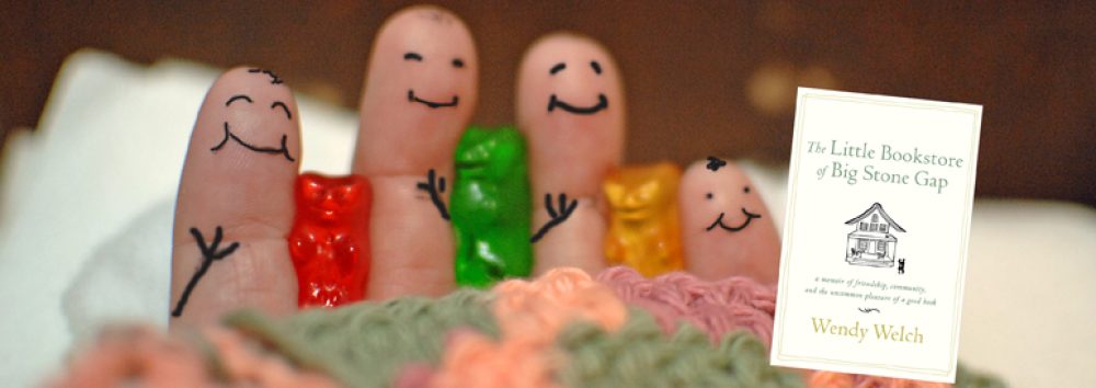
The Little Bookstore of Big Stone Gap is being translated into a slew of foreign languages, none of which either of us speak (at the last count, Chinese, Korean, Polish and Portuguese). A friend suggested I should translate it into Scots and that suddenly made the connection to the sad saga of Inspector Rebus. How will we know if ‘urban freeway’ has become ‘city bypass’ or ‘insignificant idiot’ has become ‘wee bampot’?


Publishers – bless their hearts!
Ampersand & Lawn Ornaments

After the first leg of  Wendy and Jack’s book tour they returned with books, pictures, the leftover shortbread and one giant metal ampersand. It’s now set up in the front yard, after much deliberation over its placement. And it’s a constant reminder that ampersands are super super weird. In fact, we spent a good ten minutes debating if it was facing the right way. We’ve certainly all seen plenty of ampersands (I can’t really speak for Jack and Wendy… maybe they’ve managed to avoid them thus far). But it’s just one of those shapes that’s complex, but not quite complex enough to be memorable, so it slides right out of your mind.

Definitely facing the right way… right?

Ampersands started as a form of typographic ligature, which is a combination of two different graphemes (thanks Wikipedia!). In the case of the ampersand the two graphemes are the letters E and T, and the ligature is formed when the two are smushed together (yeah, I didn’t really see it either, but check out the ampersand in fonts like Trebuchet and you’ll get the picture). “Et” is Latin for “and,” so ampersands got their start when a bunch of Romans got too lazy to write out the full word. Which is really lazy, considering they had already worked out an “and” with one less letter than ours.

Not to sound too much like a late-night English student a bit too drunk on “literary theory”, but I’m about to act like a late-night English student a bit too drunk on literary theory. What’s cool about the ampersand is that its appearance actually matters. It’s not a letter at all, but a picture. Replace the letter “A” with “#” and nothing changes. The appearance has nothing to do with the meaning. But take two meaningless symbols and push them together into an ampersand you have something  with a meaning that only exists when it looks approximately the way it’s meant to look.

AND The Little Bookstore of Big Stone Gap

And since we love reading into pictures, the ampersand has become more than just a smushed together “E” and “T.” The best example where we’ve given it a meaning for itself, separate from “and,” comes from screenwriting, where the ampersand suggests direct collaboration, whereas “and” means one writer, followed by a second rewriter. If I pop “by Michael Crichton & Andrew Whalen” on my screenplay for Jurassic Park 5: Whatever Happened to Nedry’s Shaving Cream Can? it means that the two of us have collaborated via seance. We are equal partners. But if my Jurassic Park 5: Whatever Happened to Nedry’s Shaving Cream Can? screenplay is instead by “Michael Crichton and Andrew Whalen” it means that I took something Crichton had done and rewrote it for myself without consulting him. Take away my ampersand and I go from being the brilliant necromancer co-writer of the summer 2016 blockbuster hit to being the lonely author of rip-off fan-fiction that will never see the screen.

If I were to draw some sort of conclusion out of this, then I would say that the ampersand is an appropriate symbol to have in metal on the front lawn of your bookstore. Letters just sit on the page and we make them real as we interpret them in our heads. Writers create on the page and the readers pick up these pieces and rebuild the ideas for themselves.  Staked down on the front lawn of Tales of the Lonesome Pine, alongside a toilet overgrown with vines, a plastic dimetrodon, and several stone animals wearing wire-frame spectacles, the ampersand is a kind of visual re-creation of the first step in this process, where we take simple scratches and begin to combine them into an entire visual language that can impart meaning, feelings, or hovercraft chases through space-stations. The ampersand is not a letter or an idea: it is a simple statement of how the former becomes the latter.